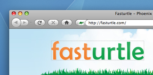
There are many different kinds of image replacement techniques exhaustively detailed around the web. Many seem quite complex, and dated, and it seems that the most popular technique I see is the Farhner method, or text-indent: -9999px. However, there is a small problem with this technique: in Firefox it draws lines stretching across your screen nearly 10,000 pixels to the left.
My preferred technique for image replacement on headings or links:
#myID {
    background: url(myImage.png) no-repeat;
    height: ...;
    width: ...;
    <strong>text-indent: 150%;
    overflow: hidden;
    white-space: nowrap;</strong>
}
This works much better than the Farhner technique. It won’t draw a dotted outline all the way across the left side of your page. It’s also much more future-proof considering the vast screen dimensions we’re likely to use. (Just imagine looking at some of your websites on a display with 16,384×12,288 resolution. All those words that were pulled 9999 pixels to the left would be visible.)
Though I’m not sure what to call this method—I’ve never seen this documented any where— I remember I first learned it by studying Tim Van Damme’s CSS. Before and after examples below.


Short URL: http://jwr.cc/x/23
Leave a Reply